library(dplyr)
library(ggplot2)
library(tidyplate)
library(drc)
library(ggtext)
library(purrr)Setup
Let’s begin by loading a few packages that we will need:
Then we import dose-response data using the tidy_plate function from the tidyplate package. I wrote this package to help researchers convert different types of microplates into tibbles which can be used in data analysis. The tidy_plate function accepts xlsx and csv files formatted in a specific way as input and supports all types of standard microplate formats namely: 6-well, 12-well, 24-well, 48-well, 96-well, 384-well, and 1536-well plates. For more information, please visit tidyplate.
raw_data <- tidy_plate("data/elisa_example.xlsx")
glimpse(raw_data)
Rows: 50
Columns: 10
$ well <chr> "A01", "A02", "A03", "A04", "A05", "A06", "B01", "…
$ coat_protein_name <chr> "sBACE", "sBACE", "sBACE", "sBACE", "sBACE", "sBAC…
$ coat_protein_ug <dbl> 0.2, 0.2, 0.2, 0.2, 0.2, 0.2, 0.2, 0.2, 0.2, 0.2, …
$ coat_protein_source <chr> "NS0", "NS0", "NS0", "NS0", "NS0", "NS0", "NS0", "…
$ primary_mab_name <chr> "aBACE", "aBACE", "aBACE", "aSARS", "aSARS", "aSAR…
$ primary_mab_clone <chr> "6626.1000000000004", "6626.1000000000004", "6626.…
$ primary_mab_conc <dbl> 10.0000000, 10.0000000, 10.0000000, 10.0000000, 10…
$ secondary_mab_name <chr> "goat-aHuman", "goat-aHuman", "goat-aHuman", "goat…
$ secondary_mab_dil <chr> "1to5000", "1to5000", "1to5000", "1to5000", "1to50…
$ od450 <dbl> 1.396, 1.170, 1.299, 1.324, 1.170, 1.299, 1.374, 1…Prepare data before plotting
blank_data <- raw_data |>
filter(primary_mab_name == "blank")
mean_blank <- mean(blank_data[["od450"]], na.rm = TRUE)
summary <- raw_data |>
filter(primary_mab_name != "blank") |>
mutate(blanked_od = od450 - mean_blank) |>
group_by(primary_mab_name, primary_mab_conc) |>
summarise(
mean_od = mean(blanked_od, na.rm = TRUE),
sd_od = sd(blanked_od, na.rm = TRUE),
.groups = 'drop'
)
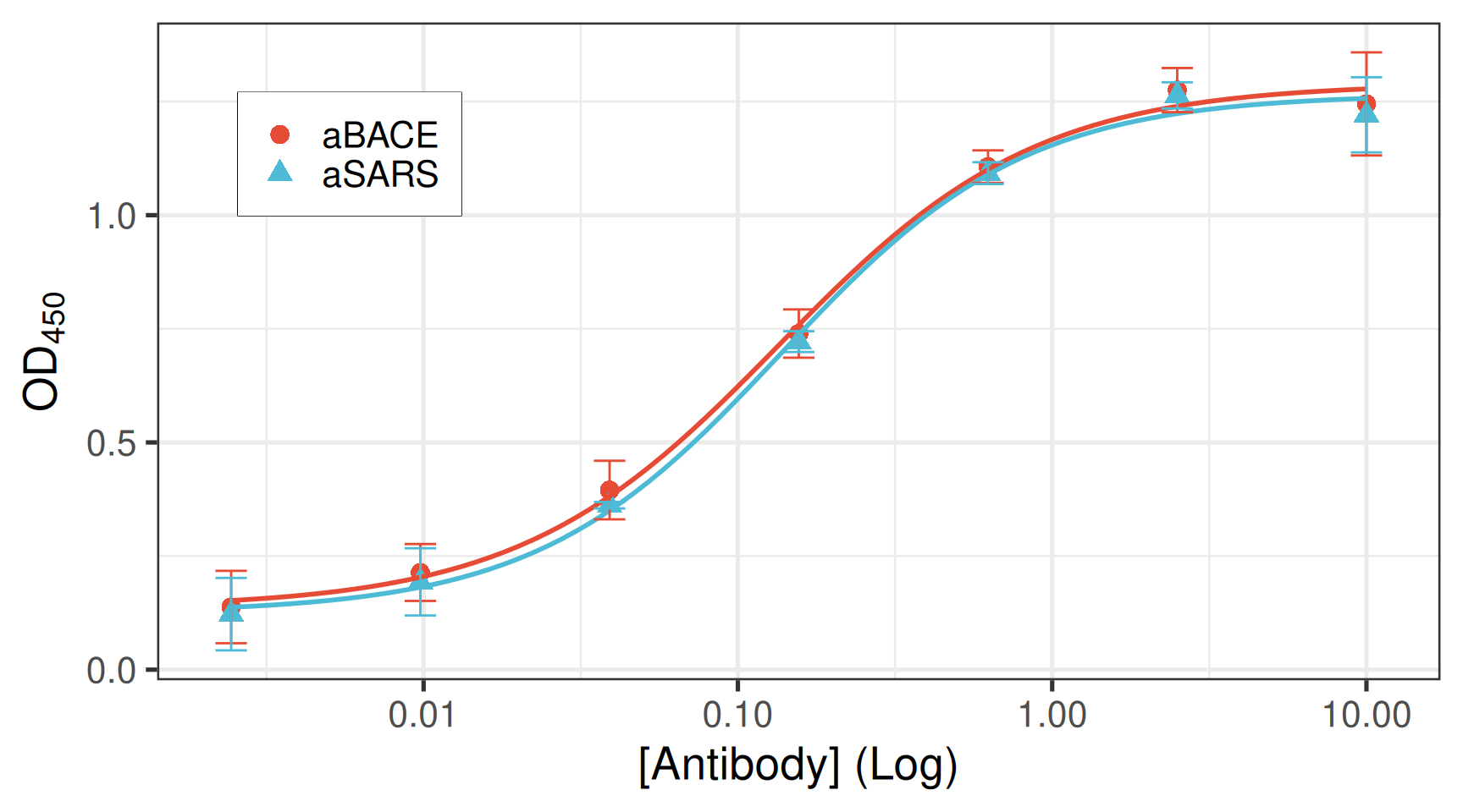
head(summary)# A tibble: 6 × 4
primary_mab_name primary_mab_conc mean_od sd_od
<chr> <dbl> <dbl> <dbl>
1 aBACE 0.00244 0.138 0.0797
2 aBACE 0.00977 0.214 0.0626
3 aBACE 0.0391 0.395 0.0644
4 aBACE 0.156 0.740 0.0531
5 aBACE 0.625 1.11 0.0358
6 aBACE 2.5 1.28 0.0486Compute EC50 for each antibody
# Helper function to fit 4PL and extract EC50 + CI per antibody
fit_one_ab <- function(df) {
  fit <- drm(
    mean_od ~ primary_mab_conc,
    data = df,
    fct  = LL.4()
  )

  ed <- ED(fit, 50, interval = "delta")
  pars <- coef(fit)
  # LL.4 parameter order is: b (hill), c (bottom), d (top), e (EC50)
  bottom <- pars["c:(Intercept)"]
  top    <- pars["d:(Intercept)"]

  # response at EC50 (midpoint of the curve)
  y_ec50 <- bottom + (top - bottom) / 2

  tibble(
    antibody = df$antibody[1],
    ec50     = ed[1, "Estimate"],
    ec50_se  = ed[1, "Std. Error"],
    ec50_low = ed[1, "Lower"],
    ec50_up  = ed[1, "Upper"]
  )
}

ec50_df <- summary |>
  group_by(primary_mab_name) |>
  group_modify(~ fit_one_ab(.x)) |>
  ungroup()
Estimated effective doses

       Estimate Std. Error    Lower    Upper
e:1:50 0.134427   0.016674 0.081364 0.187490
Estimated effective doses

       Estimate Std. Error    Lower    Upper
e:1:50 0.448393 0.045076 0.304942 0.591845ec50_df# A tibble: 2 × 5
primary_mab_name ec50 ec50_se ec50_low ec50_up
<chr> <dbl> <dbl> <dbl> <dbl>
1 aBACE 0.134 0.0167 0.0814 0.187
2 aSARS 0.448 0.0451 0.305 0.592The final plot
colors <- c("aBACE" = "#00a5a6", "aSARS" = "#e03d90")
light_colors <- prismatic::clr_lighten(colors, 0.7)

ec50_label <- ec50_df |>
  mutate(
    label = paste0(primary_mab_name, ": EC~50~ = ", signif(ec50, 3)),
    x = 0.015,
    y = c(1.3, 1.2)
  )

theme_set(theme_bw(base_size = 20))
ggplot(
  summary,
  aes(
    x = primary_mab_conc,
    y = mean_od,
    group = primary_mab_name,
    color = primary_mab_name,
    shape = primary_mab_name,
    fill = primary_mab_name
  )
) +
  geom_smooth(
    method = drc::drm,
    method.args = list(fct = drc::L.4()),
    se = FALSE,
    linewidth = 1,
    show.legend = FALSE
  ) +
  geom_errorbar(
    aes(ymin = mean_od - sd_od, ymax = mean_od + sd_od),
    width = 0.1,
    show.legend = FALSE
  ) +
  geom_point(size = 3, stroke = 1.5) +
  geom_textbox(
    data = ec50_label,
    aes(x, y, label = label),
    size = 6,
    face = "bold",
    width = 0.35,
    box.color = NA,
    fill = NA
  ) +
  scale_x_log10(labels = scales::label_log()) +
  scale_y_continuous(limits = c(0, 1.5), n.breaks = 7, expand = expansion(0)) +
  scale_color_manual(name = NULL, values = colors) +
  scale_fill_manual(name = NULL, values = light_colors) +
  scale_shape_manual(name = NULL, values = c(21, 22)) +
  labs(
    x = "Antibody (µg/mL), Log",
    y = "OD~450~ (Mean ± SE)",
    title = "<span style='color:#00a5a6'>anti-BACE</span> is more potent
      compared to <span style='color:#e03d90'>anti-SARS</span> antibody"
  ) +
  theme(
    legend.position = "none",
    plot.title = element_markdown(size = 20),
    axis.title.y = element_markdown(),
    panel.grid = element_blank()
  )