library(readr)
library(tidyverse)Introduction
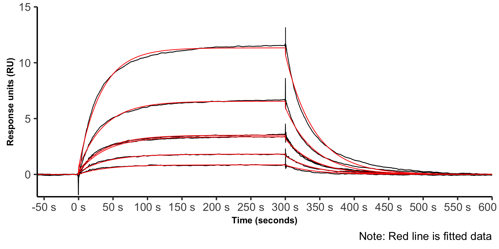
During the past weeks I was running a lot of antibody-antigen kinetics experiments on the Biacore T200. Unfortunately, the Biacore evaluation software cannot be used to make publication quality plots (as far as I know). As a result, I thought of using ggplot2 to plot biacore kinetics data. Lets jump right in.
Preparing the data
Load required libraries:
Import the data into R Studio:
raw_data <- read_delim(
  "biacore_kinetics.txt",
  escape_double = FALSE,
  trim_ws = TRUE
)
Preparing the data for plotting:
# SELECT RELEVANT COLUMNS
data_final <- raw_data %>%
  select(c(1, ends_with("Y")))

# RENAME COLUMNS (F = FITTED, NF = NOT FITTED)
names(data_final) <- c("time", "2 nM-NF", "2 nM-F", "4 nM-NF", "4 nM-F", "8 nM-NF",
                       "8 nM-F", "16 nM-NF", "16 nM-F", "32 nM-NF", "32 nM-F",
                       "8 nM (rep 2)-NF", "8 nM (rep 2)-F")

# FINAL DATA BEFORE PLOTTING
plot_data <- data_final %>%
  pivot_longer(!time, names_to = "sample", values_to = "values") %>%
  separate(col=sample, into=c("samples", "type"), sep='-') %>%
  filter(samples != "8nM (rep 2)")

# SEPARATE FITTED AND NOT FITTED DATA
not_fitted <- plot_data %>%
  filter(type == "NF")
fitted <- plot_data %>%
  filter(type == "F")
The final plot
ggplot(NULL) +
  geom_line(data = not_fitted, aes(x = time, y = values, group = samples)) +
  geom_line(data = fitted, aes(x = time, y = values, group = samples), color = "red") +
  scale_x_continuous(expand = c(0, 0),
                     limits = c(NA, 600),
                     n.breaks = 14,
                     labels = scales::label_number(suffix = " s")) +
  scale_y_continuous(expand = c(0, 0), limits = c(-2, 15)) +
  theme_classic(base_size = 20) +
  labs(
    caption = "Note: Red line is fitted data",
    color = "Soluble CD16",
    x = "Time (seconds)",
    y = "Response units (RU)"
  ) +
  theme(
    legend.position = "none",
    axis.title.x  = element_text(size = 13, face = "bold"),
    axis.title.y  = element_text(size = 13, face = "bold"),
    panel.grid.major = element_blank(),
    panel.grid.minor = element_blank()
  )