When visualizing trend data, standard line plots can sometimes look a bit too jagged. If you want to create a smoother, more aesthetically pleasing curve through your data points, splines are a great solution.
In this post, we’ll look at how to easily replace simple line plots with X-splines in ggplot2 using the geom_xspline() function from the ggfun package.
The Jagged Baseline
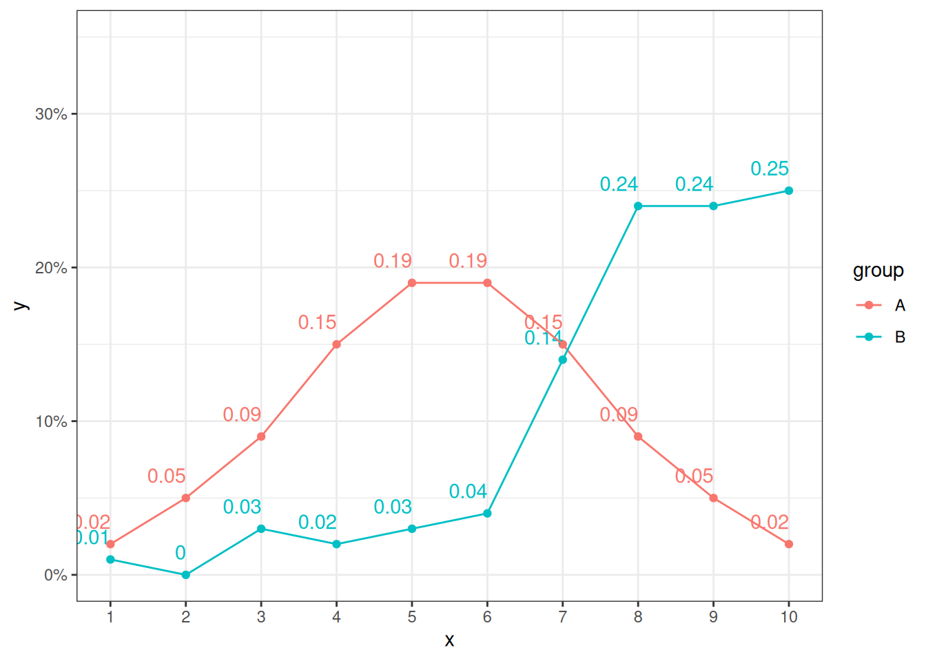
First, let’s look at the default behavior. We’ll set up a simple dataset with two groups and plot it using the standard geom_line(). Notice how the lines connect point-to-point with sharp angles.
To smooth things out, we replace geom_line() with ggfun::geom_xspline(). The most important argument here is shape.
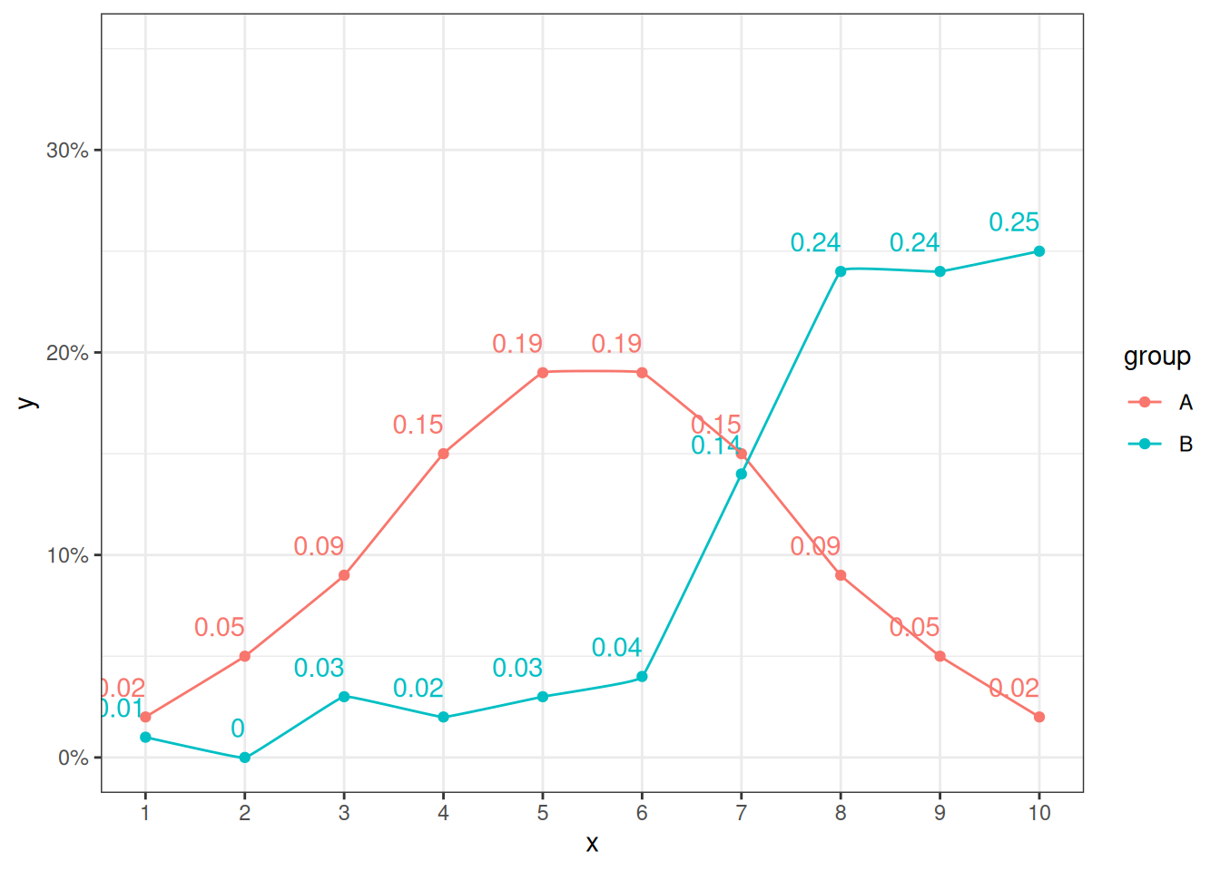
When shape is negative, the curve is forced to pass exactly through the data points (interpolation). A value close to zero (like -0.1) gives a very subtle rounding to the corners.
plot + ggfun::geom_xspline(shape =-0.1)
A Much Smoother Curve
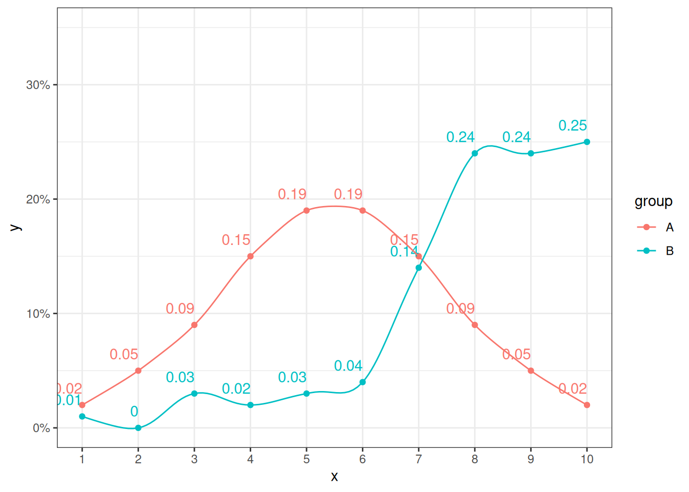
If we decrease the shape value further to -0.5, the spline bows out more between the points.
plot + ggfun::geom_xspline(shape =-0.5)
Approximating the Points
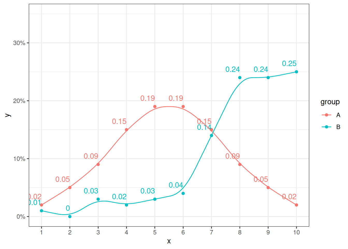
When shape is greater than 0, the line acts as an approximation.
plot + ggfun::geom_xspline(shape =0.5)
Summary
Use geom_line() for strict point-to-point connections.
Use geom_xspline(shape = -0.5) (or similar negative values) for a smooth curve that still honors your exact data values.
Use geom_xspline(shape = 0.5) (or positive values) when you want to show a generalized, smoothed trend that approximations the data path.